Modular Scales
Enhance Styles uses fluid, modular scales for type sizing and layout spacing. This page reviews the concept of these scales, describes how fluid scales improve on previous solutions, and demonstrates how you can configure these scales for best results.
What is a modular scale?
Modular scales are tools used to inform the creation of harmonious designs — which can include anything from architectural designs, graphic design, web design, and beyond. In the case of web design, modular scales are used primarily to determine aspects of design like type size and layout spacing.
Modular scales are created by taking a starting value (for example, 16 — as in the default font size in pixels of most web browsers), and multiplying that value by a certain ratio (for example, 1:1.618 — commonly known as the golden ratio). The resulting number is then multiplied by that same ratio again. Doing this repeatedly produces a range of numbers than can be used in the selection of aspects such as font sizes and the amount of space occupied by an element’s margins.
The purpose of using values produced from a modular scale is to unify multiple aspects of a page or component’s visual design. These unified designs tend to be more pleasing to the eye than designs produced without the use of a modular scale.
For a deeper dive into the concept of modular scales on the web, check out this seminal article by Tim Brown (and the Modular Scale web app).
What is a fluid scale?
Fluid scales are modular scales designed specifically for use on the web, in order to address the challenges of using modular scales responsively.
Traditionally, designers and developers have taken to using different scale values at discrete breakpoints. For example, an h1 might be typeset with a font size of 2rem on a small viewport, whereas a font size of 4rem might be used on a larger viewport. This approach can lead to awkward designs in viewports between the widths at which these changes are defined via media queries. In this example, should a viewport one pixel smaller in width than our ‘large’ viewport really have h1s set at such a drastically different font size?
Fluid scales allow font sizes, margins, padding, and other aspects of layouts to scale in size gradually across a range of viewport sizes, as opposed to changing suddenly at discrete breakpoints via media queries. Taking the previous example with our h1, a fluid scale would allow the heading’s font size to scale gradually between 2rem and 4rem based on the current viewport size (as long as that viewport size is between your chosen minimum and maximum width). This approach has been popularized by tools like Utopia.
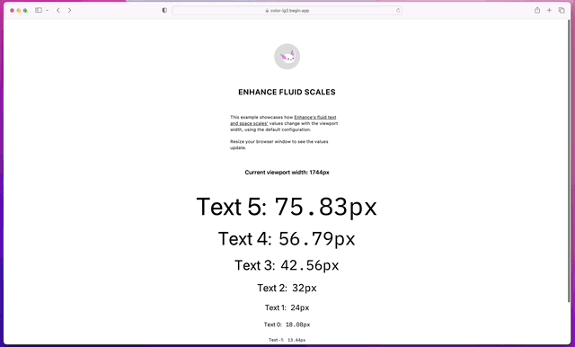
Here’s an example of a fluid modular scale for type in action — you can also explore the live version of this demo!
In addition to gracefully scaling across a range of viewport widths, using fluid type and spacing can reduce the amount of CSS you need to write (especially when it comes to CSS scoped with media queries). Of course, this strategy requires alignment between designers and developers; the Utopia blog has some great reading on this subject.
typeScale and spaceScale
Enhance Styles uses fluid scales for its font size utility classes via our typeScale configuration, and for margins, padding, and gaps (for use in flexbox and grid layouts) via our spaceScale. We also emit custom properties for each step of the type and space scales, so that these values can be used in your own element styles.
These fluid scales are customizable via the configuration file. However, the default configuration comes with some sensible defaults baked in. The default values for each of these two scales are identical; however, the ability to specify unique values for each is offered in order to accommodate a wide range of preferences.
When reviewing or customizing the typeScale and spaceScale, the key concepts to be aware of are:
Steps
Type and space scales contain a configurable number of steps. This number should be large enough to provide the designer and developer with a sufficient range of options for setting type size and layout spacing, but not so large that an excessive number of unused steps are generated (as this will bloat the CSS bundle and cause confusion for implementers).
For type scales, the steps option indicates the base step plus the number of positive steps to be generated. For example, 6 steps would produce 1 base step plus 5 positive steps. Two negative steps will also be generated, for setting type at sub-body copy sizes. Additional negative steps are not generated as this would result in illegible font sizes.
For space scales, the steps option indicates the base step plus the number of symmetric positive and negative steps to be generated. For example, 6 steps would produce 1 base step, plus 5 positive and 5 negative steps.
Viewport widths
Type and space scale values will only be fluidly interpolated between a declared minimum and maximum viewport width. Beyond these boundary sizes, the scale values will remain at their respective minimum and maximum sizes.
Base sizes
The configuration’s base sizes determine the starting value to use for the scale. Each step on the scale will get larger than this size (or smaller, for negative steps) by an amount dictated by the current viewport width and the minimum and maximum scale factors.
Enhance Styles will automatically assign the base step of the type scale (--text0) to the body element’s font-size property. Setting this property to another value will mean that your default font size will not adhere to the type scale. To change the body font size, change your typeScale.baseMin and typeScale.baseMax properties accordingly.
Scale factors
Scale factors determine the ratio at which each value in the scale grows (or shrinks) from the previous step. Larger ratios produce larger differences between each step. At the minimum viewport width, the minimum scaling factor will be used; at the maximum viewport width, the maximum scaling factor will be used. Between the minimum and maximum viewports, the scale factor will be interpolated between its minimum and maximum values, based on the viewport width.
For Enhance Styles’ configuration, the scale factors can be set using any rational number. For convenience, the following named ratios may be also be used:
| Named ratio | As a rational number |
|---|---|
minor-second |
1.067 |
major-second |
1.125 |
minor-third |
1.2 |
major-third |
1.25 |
perfect-fourth |
1.333 |
augmented-fourth |
1.414 |
perfect-fifth |
1.5 |
golden-ratio |
1.618 |
major-sixth |
1.667 |
minor-seventh |
1.778 |
major-seventh |
1.875 |
octave |
2 |
Scale configuration
Defaults
The following values are used in Enhance Styles’ default configuration.
If you provide your own typeScale or spaceScale configuration, any fields you omit will automatically use the respective default values given below.
"typeScale": {
  "steps": 6,
  "viewportMin": 320,
  "viewportMax": 1500,
  "baseMin": 16,
  "baseMax": 18,
  "scaleMin": "minor-third",
  "scaleMax": "perfect-fourth"
},
"spaceScale": {
  "steps": 6,
  "viewportMin": 320,
  "viewportMax": 1500,
  "baseMin": 16,
  "baseMax": 18,
  "scaleMin": "minor-third",
  "scaleMax": "perfect-fourth"
}
Specification
typeScale
| Property | Description |
|---|---|
| steps | The number of steps, including the base font size, to be used for the type scale. Two negative steps will be generated for setting type at sub-body sizes. |
| viewportMin | The minimum viewport width, in pixels. Font sizes will not decrease at viewports narrower than this width. |
| viewportMax | The maximum viewport width, in pixels. Font sizes will not increase at viewports wider than this width. |
| baseMin | The base font size, in pixels, to be used at the minimum viewport width. |
| baseMax | The base font size, in pixels, to be used at the maximum viewport width. |
| scaleMin | The minimum scaling factor, either as a rational number or a named ratio, to be used for computing all steps above and below the base font size, at the minimum viewport width. |
| scaleMax | The maximum scaling factor, either as a rational number or a named ratio, to be used for computing all steps above and below the base font size, at the maximum viewport width. |
spaceScale
| Property | Description |
|---|---|
steps |
The number of steps, including the base step, to be used for the space scale. A symmetric number of positive and negative steps will be generated (for example, 6 steps would generate 1 base step, 5 positive steps, and 5 negative steps). |
viewportMin |
The minimum viewport width, in pixels. Spacing sizes will not decrease at viewports narrower than this width. |
viewportMax |
The maximum viewport width, in pixels. Spacing sizes will not increase at viewports wider than this width. |
baseMin |
The base spacing size, in pixels, to be used at the minimum viewport width. |
baseMax |
The base spacing size, in pixels, to be used at the maximum viewport width. |
scaleMin |
The minimum scaling factor, either as a rational number or a named ratio, to be used for computing all steps above and below the base size, at the minimum viewport width. |
scaleMax |
The maximum scaling factor, either as a rational number or a named ratio, to be used for computing all steps above and below the base size, at the maximum viewport width. |